Key IDEA: Chart types are great shortcuts but graphics are really sophisticated visual structures
GoFish language for python using the Gestalt grouping principle. It can make graphics or chart that can display the messages that are intentional.
.mark() – what shape to draw at each postion and what channels to encode
part to whole relationships are possible with a stack() operator
Nesting order matters – what is grouped with what …
Vs Panda’s : what makes visualization’s effective is the value proposition. Declarative way to decide how the charts are structured.
Sometimes a heat map shows the data better than a bar chart or a line chart for multiple axis.
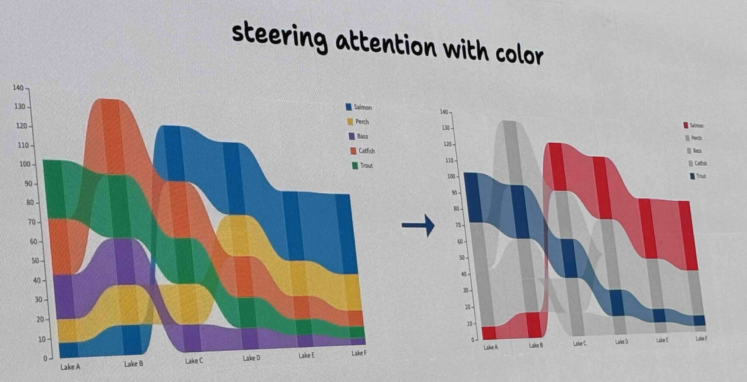
Similarly depending on the message – a ribbon chart flowing across the graph shows the message better. Sometimes in the data schema…
It is possible to use color for steering attention:
As example : New York Times uses color to promote or demote queries.
https://vis.csail.mit.edu/pubs/gofish
Pie charts are usually not great for showing differences among them…but in very special cases they can show relationships (see photo).
Sometimes a flower or ballon chart can show relationships that can make some properties stick out.
——