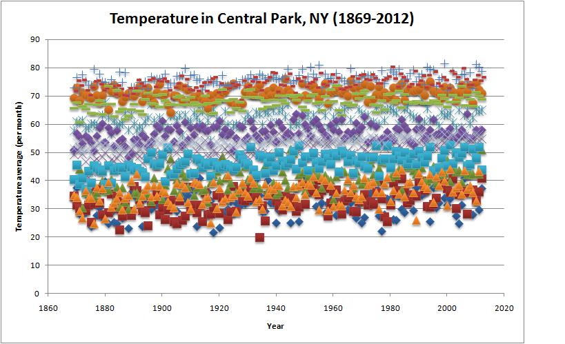
It is very difficult to analyze large data sets using statistical methods if the variation in data is high. The statistical method requires large samples to average out the noise. Even then to spot a pattern takes an enormous amount of time. However, sometimes the right visualization helps one understand the data very easily rather than pure mathematical analysis.
Consider the problem of climate change. The variation in data sets of temperature is so high that it has been difficult for climatologists to convince the general populace that the average temperature is rising. Whether that is due to CO2, water vapor, human activity or any other cause has led to further argument but the basic tenet that the average temperature has gone up has also been argued.
The graph on the left shows the average temperature in any month plotted against the years. So generally the colder months (January, February) are at the bottom and the hotter months (July, August) is at the top. Just by looking at the plot over the years makes it easy to tell that the average temperature has been rising through the years. The effect is subtle and if it were not for the large averaging that we perform in our eyes/brain then it would have been difficult to tell.
(the graphical data is from the National weather service)
